CSS教程
CSS 函数
| 函数 | 描述 | CSS 版本 | |----|-----|-----| | attr() | 返回选择元素的属性值。 | 2 | | calc() | 允许计算 CSS 的属性值,比如动态计算长度值。 | 3 | | cubic-bezier() | 定义了一个贝塞尔曲线(Cubic Bezier)。 | 3 | | conic-gradient() | 定义了一个圆锥渐变。 | 3 | | counter() | 设置计数器。 | 3 | | hsl() | 使用色相、饱和度、亮度来定义颜色。 | 3 | | hsla() | 使用色相、饱和度、亮度、透明度来定义颜色。 | 3 | | linear-gradient() | 创建一个线性渐变的图像 | 3 | | max() | 从一个逗号分隔的表达式列表中选择最大的值作为属性的值。 | 3 | | min() | 从一个逗号分隔的表达式列表中选择最小的值作为属性的值。 | 3 | | radial-gradient() | 用径向渐变创建图像。 | 3 | | repeating-linear-gradient() | 用重复的线性渐变创建图像。 | 3 | | repeating-radial-gradient() | 类似 radial-gradient(),用重复的径向渐变创建图像。 | 3 | | repeating-conic-gradient() | 重复的圆锥渐变。 | 3 | | rgb() | 使用红(R)、绿(G)、蓝(B)三个颜色的叠加来生成各式各样的颜色。 | 2 | | rgba() | 使用红(R)、绿(G)、蓝(B)、透明度(A)的叠加来生成各式各样的颜色。 | 3 | | var() | 用于插入自定义的属性值。 | 3 | | repeat() | 表示轨道列表的重复片段。 | 3 | | minmax() | 定义了一个长宽范围的闭区间。 | 3 | ## attr() 函数 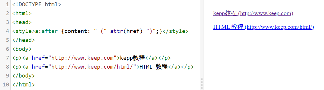 ## calc() 函数 - calc() 函数用于动态计算长度值。 - 需要注意的是,运算符前后都需要保留一个空格,例如:width: calc(100% - 10px); - 任何长度值都可以使用calc()函数进行计算; - calc()函数支持 "+", "-", "*", "/" 运算; - calc()函数使用标准的数学运算优先级规则; 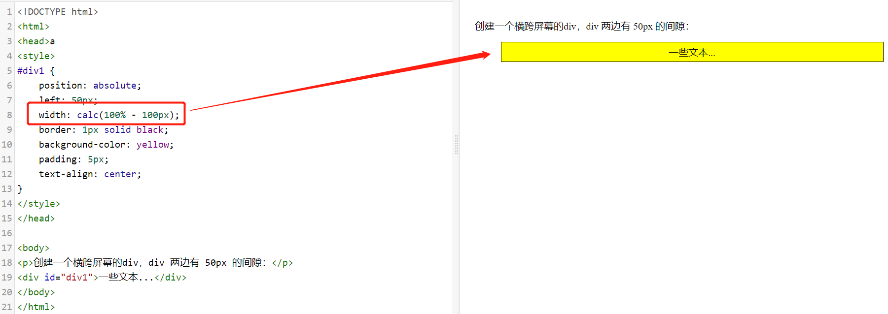 ## cubic-bezier() 函数 - 语法:cubic-bezier(x1,y1,x2,y2) - 属性值 - x1,y1,x2,y2:必需。数字值,都是 0 到 1 的数字。 ```css div { width: 100px; height: 100px; background: red; transition: width 2s; transition-timing-function: cubic-bezier(0.1, 0.7, 1.0, 0.1); } ``` ## counter() 函数 - 语法:counter(countername, counterstyle) - 属性值 - countername:必需。 计数器的名称(与 counter-reset 和 counter-increment 属性使用的名称相同)。 - counterstyle:可选的。 计数器的样式(可以是 CSS list-style-type 属性值)。 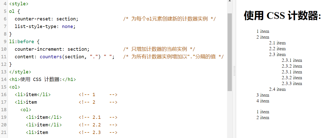 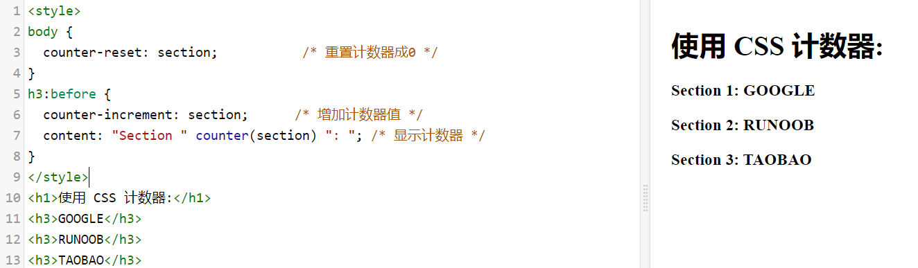 ## max() 、min()函数 - 语法 - max(value1, value2, ...) - min(value1, value2, ...) - 实例 ```css ##设置为最大的值,取 50% 或 300px 的最大值 width: max(50%, 300px); ##设置为最小的值,取 50% 或 300px 的最小值: width: min(50%, 300px); ``` ## conic-gradient() 函数 - 圆锥渐变是颜色过渡围绕中心点旋转(而不是从中心向外辐射)。 - 创建圆锥渐变,至少需要设置两个色标。 - 语法:background-image: conic-gradient([from angle] [at position,] color degree, color degree, ...); - 属性值 - from angle:可选。起始角度。默认值为 0deg - at position:可选。中心位置。默认居中。 - color degree, ..., color degree:角渐变断点。该值包含一个颜色值,后跟一个可选的停止位置( 0 到 360 之间的度数或 0% 到 100% 之间的百分比)。 - 实例 ```css background-image: conic-gradient(red 0deg, red 90deg, yellow 90deg, yellow 180deg, green 180deg); 代码解析: red 0deg, red 90deg 表示 0~90 度区间使用红色 red。 yellow 90deg, yellow 180deg 表示 90~180 度区间使用黄色 yellow。 green 180deg 表示 180~360 度区间使用绿色 green。 ``` - 三种颜色的圆锥渐变: ```css #grad { background-image: conic-gradient(red, yellow, green); } ``` - 三种颜色圆锥渐变,并设置每种渐变度数: ```css #grad { background-image: conic-gradient(red 45deg, yellow 90deg, green 210deg) } ``` - 五种颜色的圆锥渐变: ```css #grad { background: conic-gradient(red, orange, yellow, green, blue); } ``` - 通过设置 border-radius: 50% 把圆锥渐变变成一个圆: ```css #grad { background-image: conic-gradient(red, yellow, green, blue, black); border-radius: 50%; } ``` - 设置起始角度: ```css #grad { background-image: conic-gradient(from 90deg, red, yellow, green); border-radius: 50%; } ``` - 指定中心位置: ```css #grad { background-image: conic-gradient(at 60% 45%, red, yellow, green); border-radius: 50%; } ``` - 指定一个位置,并且设置一个角度: ```css #grad { background-image: conic-gradient(from 90deg at 60% 45%, red, yellow, green); border-radius: 50%; } ``` - 创建一个取色卡: ```css #grad { background: radial-gradient(closest-side, gray, transparent), conic-gradient(red, magenta, blue, aqua, lime, yellow, red); border-radius: 50%; ``` ## radial-gradient() 、repeating-radial-gradient()函数 - 语法: - background-image: radial-gradient(shape size at position, start-color, ..., last-color); - background-image: repeating-radial-gradient(shape size at position, start-color, ..., last-color); - 属性值 - shape:确定圆的类型: - ellipse (默认): 指定椭圆形的径向渐变。 - circle :指定圆形的径向渐变 - size:定义渐变的大小,可能值: - farthest-corner (默认) : 指定径向渐变的半径长度为从圆心到离圆心最远的角 - closest-side :指定径向渐变的半径长度为从圆心到离圆心最近的边 - closest-corner : 指定径向渐变的半径长度为从圆心到离圆心最近的角 - farthest-side :指定径向渐变的半径长度为从圆心到离圆心最远的边 - position:定义渐变的位置。可能值: - center(默认):设置中间为径向渐变圆心的纵坐标值。 - top:设置顶部为径向渐变圆心的纵坐标值。 - bottom:设置底部为径向渐变圆心的纵坐标值。 - start-color, ..., last-color 用于指定渐变的起止颜色。 - 实例 - 颜色结点不均匀分布: ```css #grad { background-image: radial-gradient(red 5%, green 15%, blue 60%); } ``` - 圆形径向渐变: ```css #grad { background-image: radial-gradient(circle, red, yellow, green); } ``` - 不同尺寸大小关键字的使用: ```css #grad1 { background-image: radial-gradient(closest-side at 60% 55%, blue, green, yellow, black); } #grad2 { background-image: radial-gradient(farthest-side at 60% 55%, blue, green, yellow, black); } ``` ## repeating-linear-gradient() 函数 - 语法:background: repeating-linear-gradient(angle | to side-or-corner, color-stop1, color-stop2, ...); - 属性值 - angle:定义渐变的角度方向。从 0deg 到 360deg,默认为 180deg。 - side-or-corner:指定线性渐变的起始位置。由两个关键字组成:第一个为指定水平位置(left 或 right),第二个为指定垂直位置(top 或bottom)。 顺序是随意的,每个关键字都是可选的。 - color-stop1, color-stop2,...:指定渐变的起止颜色,由颜色值、停止位置(可选,使用百分比指定)组成。 - 实例 - 不同的重复线性渐变: ```css #grad1 { background-image: repeating-linear-gradient(45deg, red, blue 7%, green 10%); } #grad2 { background-image: repeating-linear-gradient(190deg, red, blue 7%, green 10%); } #grad3 { background-image: repeating-linear-gradient(90deg, red, blue 7%, green 10%); } ``` ## repeating-conic-gradient() 函数 - 语法:background-image: repeating-conic-gradient([from angle] [at position,] color degree, color degree, ...); - 属性值 - from angle:可选。起始角度。默认值为 0deg。 - at position:可选。中心位置。默认居中。 - color degree, ..., color degree:角渐变断点。该值包含一个颜色值,后跟一个可选的停止位置( 0 到 360 之间的度数或 0% 到 100% 之间的百分比)。 - 实例 - 设置开始颜色和停止颜色的重复圆锥渐变: ```css #grad { background-image: repeating-conic-gradient(red 0deg 30deg, yellow 30deg 60deg, blue 60deg 90deg); } ``` ## hsl() 函数 - 语法:hsl(hue, saturation, lightness) - 属性值 - hue - 色相:定义色相 (0 到 360) - 0 (或 360) 为红色, 120 为绿色, 240 为蓝色 - saturation - 饱和度:定义饱和度; 0% 为灰色, 100% 全色 - lightness - 亮度:定义亮度 0% 为暗, 50% 为普通, 100% 为白 - 实例 ```css #p1 {background-color:hsl(120,100%,50%);} /* 绿色 */ #p2 {background-color:hsl(120,100%,75%);} /* 浅绿 */ #p3 {background-color:hsl(120,100%,25%);} /* 暗绿 */ #p4 {background-color:hsl(120,60%,70%);} /* 柔和的绿色 */ ``` ## hsla() 函数 - 语法:hsla(hue, saturation, lightness, alpha) - 属性值: - hue - 色相:定义色相 (0 到 360) - 0 (或 360) 为红色, 120 为绿色, 240 为蓝色 - saturation - 饱和度:定义饱和度; 0% 为灰色, 100% 全色 - lightness - 亮度:定义亮度 0% 为暗, 50% 为普通, 100% 为白 - alpha - 透明度:定义透明度 0(透完全明) ~ 1(完全不透明) - 实例 ```css #p1 {background-color:hsl(120,100%,50%,0.3);} /* 绿色 */ #p2 {background-color:hsl(120,100%,75%,0.3);} /* 浅绿 */ #p3 {background-color:hsl(120,100%,25%,0.3);} /* 暗绿 */ #p4 {background-color:hsl(120,60%,70%,0.3);} /* 柔和的绿色 */ ``` ## rgb() 函数 - 语法:rgb(red, green, blue) - 属性值 - red:定义红色值,取值范围为 0 ~ 255,也可以使用百分比 0% ~ 100%。 - green:定义绿色值,取值范围为 0 ~ 255,也可以使用百分比 0% ~ 100%。 - blue:定义蓝色值,取值范围为 0 ~ 255,也可以使用百分比 0% ~ 100%。 - 实例 ```css #p1 {background-color:rgb(255,0,0);} /* 红 */ #p2 {background-color:rgb(0,255,0);} /* 绿 */ #p3 {background-color:rgb(0,0,255);} /* 蓝 */ ``` ## rgba() 函数 - 语法:rgb(red, green, blue, alpha) - 属性值 - red:定义红色值,取值范围为 0 ~ 255,也可以使用百分比 0% ~ 100%。 - green:定义绿色值,取值范围为 0 ~ 255,也可以使用百分比 0% ~ 100%。 - blue:定义蓝色值,取值范围为 0 ~ 255,也可以使用百分比 0% ~ 100%。 - alpha - 透明度 定义透明度 0(完全透明) ~ 1(完全不透明) - 实例 ```css #p1 {background-color:rgba(255,0,0,0.3);} /* 红 */ #p2 {background-color:rgba(0,255,0,0.3);} /* 绿 */ #p3 {background-color:rgba(0,0,255,0.3);} /* 蓝 */ ``` ## var() 函数 - 语法:var(custom-property-name, value) - 属性值 - custom-property-name:必需。自定义属性的名称,必需以 -- 开头。 - value:可选。备用值,在属性不存在的时候使用。 - 实例 - 使用 var() 函数调用多个自定义的值: ```css :root { --main-bg-color: coral; --main-txt-color: blue; --main-padding: 15px; } #div1 { background-color: var(--main-bg-color); color: var(--main-txt-color); padding: var(--main-padding); } #div2 { background-color: var(--main-bg-color); color: var(--main-txt-color); padding: var(--main-padding); } ``` ## repeat() 函数 - 属性值: - length:正整数长度。 - percentage:相对于列网格轨道中网格容器的行内大小以及行网格轨道中网格容器的块大小的非负百分比。如果网格容器的大小取决于它的轨道大小,那么 percentage 必须被视为 auto. 用户代理(user-agent)可以将轨道的固有大小贡献调整为网格容器的大小,将轨道的最终大小增加到可以遵守该百分比的最小数量。 - flex:带有 fr 单位的非负尺寸指定轨道的弹性系数。任何被 flex 指定大小的轨道会根据其弹性系数按比例分配剩余空间。 - max-content:代表占据网格轨道的网格项目所分配的最大内容区域的最大值。 - min-content:代表占据网格轨道的网格项目所分配的最小内容区域的最小值。 - auto:作为最大值,等同于 max-content。作为最小值,它代表占据网格轨道的网格项目的最小尺寸的最大值(如同min-width/min-height所指定的))。 - auto-fill:如果网格容器在相关轴上具有确定的大小或最大大小,则重复次数是最大可能的正整数,不会导致网格溢出其网格容器。如果定义了,将每个轨道视为其最大轨道尺寸大小函数 ( grid-template-rows 或 grid-template-columns用于定义的每个独立值。 否则,作为最小轨道尺寸函数,将网格间隙加入计算。如果重复次数过多,那么重复值是 1 。否则,如果网格容器在相关轴上具有确定的最小尺寸,重复次数是满足该最低要求的可能的最小正整数。否则,指定的轨道列表仅重复一次。 - auto-fit:行为与 auto-fill 相同,除了放置网格项目后,所有空的重复轨道都将折叠。空轨道是指没有流入网格或跨越网格的网格项目。(如果所有轨道都为空,则可能导致所有轨道被折叠。) 折叠的轨道被视为具有单个固定轨道大小函数为 0px,两侧的槽都折叠了。 为了找到自动重复的轨道数,用户代理将轨道大小限制为用户代理指定的值(例如 1px),以避免被零除。 - 实例 ```css /* <track-repeat> values */ repeat(4, 1fr) repeat(4, [col-start] 250px [col-end]) repeat(4, [col-start] 60% [col-end]) repeat(4, [col-start] 1fr [col-end]) repeat(4, [col-start] min-content [col-end]) repeat(4, [col-start] max-content [col-end]) repeat(4, [col-start] auto [col-end]) repeat(4, [col-start] minmax(100px, 1fr) [col-end]) repeat(4, [col-start] fit-content(200px) [col-end]) repeat(4, 10px [col-start] 30% [col-middle] auto [col-end]) repeat(4, [col-start] min-content [col-middle] max-content [col-end]) /* <auto-repeat> values */ repeat(auto-fill, 250px) repeat(auto-fit, 250px) repeat(auto-fill, [col-start] 250px [col-end]) repeat(auto-fit, [col-start] 250px [col-end]) repeat(auto-fill, [col-start] minmax(100px, 1fr) [col-end]) repeat(auto-fill, 10px [col-start] 30% [col-middle] 400px [col-end]) /* <fixed-repeat> values */ repeat(4, 250px) repeat(4, [col-start] 250px [col-end]) repeat(4, [col-start] 60% [col-end]) repeat(4, [col-start] minmax(100px, 1fr) [col-end]) repeat(4, [col-start] fit-content(200px) [col-end]) repeat(4, 10px [col-start] 30% [col-middle] 400px [col-end]) ``` ## minmax() 函数 - 属性值 - length:非负长度。 - percentage:相对于列网格轨道中网格容器的行内大小以及行网格轨道中网格容器的块大小的非负百分比。如果网格容器的大小取决于它的轨道大小,那么 percentage 必须被视为 auto. 用户代理(user-agent)可以将轨道的固有大小贡献调整为网格容器的大小,将轨道的最终大小增加到可以遵守该百分比的最小数量。 - flex:带有 fr 单位的非负尺寸指定轨道的弹性系数。任何被 flex 指定大小的轨道会根据其弹性系数按比例分配剩余空间。 - max-content:表示网格的轨道长度自适应内容最大的那个单元格。 - min-content:表示网格的轨道长度自适应内容最小的那个单元格。 - auto:作为最大值,等同于 max-content。作为最小值,它代表占据网格轨道的网格项目的最小尺寸的最大值(如同min-width/min-height所指定的))。 - 实例 ```css /* <inflexible-breadth>, <track-breadth> values */ minmax(200px, 1fr) minmax(400px, 50%) minmax(30%, 300px) minmax(100px, max-content) minmax(min-content, 400px) minmax(max-content, auto) minmax(auto, 300px) minmax(min-content, auto) /* <fixed-breadth>, <track-breadth> values */ minmax(200px, 1fr) minmax(30%, 300px) minmax(400px, 50%) minmax(50%, min-content) minmax(300px, max-content) minmax(200px, auto) /* <inflexible-breadth>, <fixed-breadth> values */ minmax(400px, 50%) minmax(30%, 300px) minmax(min-content, 200px) minmax(max-content, 200px) minmax(auto, 300px) ```
顶部
收展
底部
[TOC]
目录
CSS创建
CSS 单位
CSS 颜色
CSS 选择器
CSS 函数
相关推荐
CSS属性
CSS进阶